Table of Contents
With mastery comes great power; so, in the frontend development world, one language that every developer must learn is the layout techniques. CSS Grid and Flexbox are arguably the most talked-about and widely adopted layout systems in modern CSS, but there are times when one is more suited for the task than the other.
In this article, CSS Grid vs Flexbox will be compared in every way, with some use cases discussed, code samples shown, and how layout in modern CSS is thought of. New or experienced in the industry, one walking out will, at least, have a clear understanding of how dynamic layouts are achieved in either system.
What Is CSS Grid vs Flexbox?
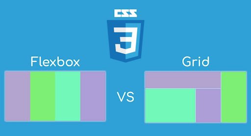
Both are modern CSS layout methods but they do not address the same problems.
➤ CSS Grid
It’s two-dimensional; thus, it lays out both rows and columns-a complete layout that can have things like a full-page layout, content-heavy dashboards, and image galleries.
➤ Flexbox
Flexbox is one-dimensional, which means it can arrange a collection in either way but not both at once: for instance, a row or a column. It is primarily used for the simpler UI components like navbars, buttons, form elements, etc.
Regarding CSS GRID and Flexbox, it is simply, “all about:
Grid: complete layouts Flexbox: smaller one-axis content alignment.”
CSS Container Properties: The Backbone of Layouts
CSS container properties are the catchphrase to making any layout scenario possible.
display: flex; /* Enables Flexbox */
display: grid; /* Enables Grid */
flex-direction /* Flexbox axis */
grid-template-columns /* Grid column control */
align-items /* Vertical alignment */
justify-content /* Horizontal alignment */
We have talked about these properties for every possible layout in modern CSS; if you know them, they would lead you to responsive and flexible designs with a lot of beauty.

Flexbox Layout Tricks for Everyday UI
Flexbox is most commonly used for responsivity or small-scale alignment. Here are a few layout tricks worth knowing for every developer using Flexbox:
➤ Responsive Card or Navbar
.container {
display: flex;
flex-wrap: wrap;
justify-content: space-between;
}
This creates a flexible, responsive container. It’s perfect for toolbars, navbars, or card layouts that adjust to screen size.
➤ Auto Margin Alignment
.button {
margin-left: auto;
}
This trick stretches the buttons to the end of the row, which helps align navigation or form elements.
You will be using these flexbox layout tricks in your projects and components every day. They will become an essential toolbox for working with CSS container properties.
Grid Layout Tutorial CSS: Real Examples
CSS Grid is perfect when your design requires rows and columns. Here’s a simple grid layout tutorial CSS example:
.grid-container {
display: grid;
grid-template-columns: repeat(3, 1fr);
gap: 20px;
}
.item {
background: #ccc;
padding: 20px;
}
This layout divides your container width among three equal columns—perfect for portfolios, blogs, and dashboards.
There, these grid layout tutorial CSS examples become powerful to use for defining areas with CSS container properties.
Nested Flexbox vs Grid: Combining the Best of Both
In real applications, two systems are often mixed, called the Nested Flexbox vs Grid approach.
Example:
- Use CSS Grid for the main page structure.
- Use Flexbox inside grid items for inner alignment.
.page {
display: grid;
grid-template-areas:
“header header”
“sidebar main”
“footer footer”;
grid-template-columns: 200px 1fr;
}
.navbar {
display: flex;
justify-content: space-between;
}
In this Nested Flexbox vs Grid method, Grid is used to lay out the structure, and Flexbox is used to Align Elements within sections like headers or navbars.
Flexbox vs Grid Performance: What’s Faster?
The performance of flexbox vs. grid would concern you when moving high-scale applications.
- Flexbox can be slightly faster when handling many dynamic elements in one axis.
- CSS Grid is more efficient for static, structured two-dimensional layouts.
In most use cases, performance difference is negligible, and thus the focus should instead be placed on adopting whichever system suits best for your layout with respect to modern CSS goals.
CSS Grid vs Flexbox: Summary of Use Cases
Let’s break down the most common CSS Grid vs Flexbox scenarios:
| Use Case | Choose This |
| Full-page or dashboard layout | CSS Grid |
| Responsive component alignment | Flexbox |
| Complex rows and columns | CSS Grid |
| Navbar or toolbar layout | Flexbox |
| Dynamic card wrapping | Flexbox |
| Structured homepage layout | CSS Grid |
CSS Grid Use Cases in Real Projects
Here are practical CSS Grid use cases you’ll encounter:
1. Responsive Website Layouts
Using Grid gives a semantic way to define areas such header, nav, main, and footer.
2. Image Galleries
Grid adapts the rows/columns of images without any JS using features like auto-fit and minmax.
3. Admin Panels or CMS Layouts
Dashboards are well-placed using Grid, suitable for cards, tables, and widgets.
Examples of CSS for grid layout will be useful in speeding up the development process and making the structure of the above cases.
Final Thoughts: Use Both Smartly
Here is how to do well in layouting in modern CSS:
- Flexbox for single direction layouting of components.
- Grid for full-page layouts or 2-dimensional arrays of contents.
- Use a nested Flexbox within Grid for maximum flexibility.
- Always understand the CSS container properties that power these layouts.
And remember, performance-wise, flexbox vs grid performance is rarely an issue unless you’re animating or manipulating thousands of nodes.
For more practical layout tips, explore
CSS Grid is ideal for two-dimensional layouts where you want full control over rows and columns. For deeper learning, see the official MDN CSS Grid guide.
Flexbox is great for one-dimensional layouts and is especially useful for aligning items along a single row or column. You can explore more concepts in the MDN Flexbox tutorial.
You can view other articles in our website here.


