Table of Contents
If you’re just beginning the trip into the web development realm, mastering the CSS Flexbox should be top on that list. It provides a powerful module for layout, allowing for flexible and responsive designs without the hassles of floats and positioning.
This comprehensive guide will lead you through Flexbox, how it operates, and how to build real layouts with fully explainable examples.
What is CSS Flexbox?
Flexbox is an abbreviation for Flexible Box Layout, defined as an array of CSS3 properties for a layout model positioning elements well within a container while they have unknown or dynamic sizes. It makes alignment, spacing, and distribution very easy, particularly with respect to responsive designs.
Basic Structure of Flexbox
Before diving into examples, you need to understand two main components:
- Flex Container: The parent element.
- Flex Items: The children of the flex container.
.flex-container {
display: flex;
}
All direct child elements of .flex-container will become flex items.
Main Axis vs Cross Axis
Understanding the axes is key:
- Main Axis: Identified by flex-direction (default row – from left to right)
- Cross Axis: Perpendicular to main axis
Such that justify-content can be applied on the main axis, and align-items on the cross.
Essential Flexbox Properties
Most important properties are found here clearly for the reader’s understanding.
Flex Container Properties
display: flex;
This is the way to activate Flexbox on a container.
- flex-direction
Controls direction of items:
flex-direction: row | row-reverse | column | column-reverse;
- justify-content
Aligns items along the main axis:
justify-content: flex-start | flex-end | center | space-between | space-around | space-evenly;
- align-items
Aligns items on the cross axis:
align-items: stretch | flex-start | flex-end | center | baseline;
- flex-wrap
Controls whether items wrap or stay in one line:
flex-wrap: nowrap | wrap | wrap-reverse;
- gap
Adds spacing between flex items:
gap: 20px;
- Flex Item Properties
flex
A shorthand for:
flex: [grow] [shrink] [basis];
Example:
flex: 1 1 200px;
- align-self
Overrides align-items for a specific item. - order
Controls the visual order of items (not the HTML order):
order: 1;
Practical Examples of Flexbox
Let’s look at real use cases to understand how Flexbox simplifies layout design.
Example 1: Horizontal Navigation Bar
<nav class=”nav”>
<a href=”#”>Home</a>
<a href=”#”>About</a>
<a href=”#”>Services</a>
<a href=”#”>Contact</a>
</nav>
.nav {
display: flex;
justify-content: space-around;
background-color: #333;
}
.nav a {
color: white;
text-decoration: none;
padding: 10px 20px;
}
Result: Evenly spaced links across a horizontal bar.
Example 2: Responsive Card Layout
<div class=”card-container”>
<div class=”card”>Card 1</div>
<div class=”card”>Card 2</div>
<div class=”card”>Card 3</div>
</div>
.card-container {
display: flex;
flex-wrap: wrap;
gap: 20px;
}
.card {
flex: 1 1 200px;
background: #f3f3f3;
padding: 20px;
text-align: center;
}
Result: Cards automatically wrap on smaller screens and adapt to available space.Example 3: Centering Content Vertically and Horizontally
<div class=”center-box”>
<p>Perfectly Centered</p>
</div>
.center-box {
display: flex;
justify-content: center;
align-items: center;
height: 300px;
background: #e5e5e5;
}
Result: Text is centered both horizontally and vertically—no need for margins or positioning.
Why CSS Flexbox is Ideal for Responsive Design
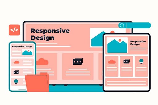
Flexbox is initially more suited for mobile interfaces, with adaptive capability according to different sizes of screens. You can use flex-wrap and gap in incorporating some media queries to create cool layouts with minimal coding effort.
When Not to Use Flexbox
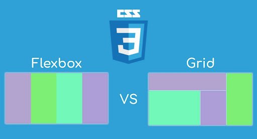
While Flexbox are very powerful, they are still quite limited in use. They do best for a layout that is one-dimensional, whether row or column. For two-dimensional layouts—grid-style rows and columns—CSS Grid is more flexible.
Conclusion
Flexbox is the most critical tool in modern CSS. It straightens all your layouts into responsive, pretty looking, yet easy-maintained shapes. The more you learn Flexbox, the less CSS will be required for increasingly more dynamic designs.
Building a navigation bar, aligning elements, or making responsive cards—but of course, Flexbox.
Quick Recap
- Last but clearly not least, the display flex transforms an element into a flex container
- Using flex-direction, justify-content, and align-items would control their layout
- Flexbox is indeed best for responsive design and centering content
- Combine with media queries for all-round control
Bookmark this guide for your earlier self then try building the examples above to solidify your understanding of CSS Flexbox.




One thought on “CSS Flexbox Complete Guide for Beginners (With Practical Examples)”